C A S E S T U D Y

MY CORE OWNERSHIP
Literature review & research strategy
User interviews & focus group
Affinity, empathy & journey mapping
Personas, POV & How-Might-We framing
Rapid ideation & Crazy 8s
Paper, mid-fi & high-fi prototyping
Usability testing across three rounds
DURATION
4 months
ROLE
End-to-End Product Designer
SCOPE
University coursework · Mobile app(iOS) · Kingston upon Thames
OVERVIEW
Quick Context
Over four months I took it from literature review to a tested high-fidelity build: research, synthesis, framing, ideation, and three rounds of prototype testing. The process below is shown through the actual artifacts.






RESEARCH
It started with a habit of mine. I would want to go out and end up staying in, mostly because I didn’t know what there was to do. Before talking to anyone, I went through the literature on motivation, barriers and everyday walking habits, and mapped what I found.
Knowing a place exists doesn’t get people out. Having a reason to go does.
People need a destination first
People hesitate to go out when they don’t have a clear purpose or destination. The wish to go out often comes before any idea of where.
Knowing about a place is not the same as wanting to go
Awareness alone doesn’t create a visit. Deciding is its own barrier, separate from distance or cost.
Finding something to do should feel easy
If finding something to do feels like another task, people stay in. It has to feel easy, not like admin.
THE LITERATURE MAP · ORIGINAL ARTIFACT

The literature map. The main takeaways: motivation splits into internal and external drivers, barriers are usually emotional rather than practical, and walking is the most common everyday activity a product like this can build on.
USER RESEARCH
Listening to users
I ran five interviews, then a focus group where participants wrote love letters and break-up letters to the ways they currently find places to go.
I coded each transcript line by line, one observation per sticky note, so nothing stayed a vague impression.
The same pattern kept coming up: people were unsure what was available nearby. The letters added the feeling behind it, what people valued and what quietly put them off.

Transcripts, coded line by line. Three of five participants shown.

Love letters and break-up letters from the focus group session.
SYNTHESIS
From comments to patterns
Every observation from the five interviews and the focus group went onto one board. I grouped similar comments, named the groups, and looked for patterns.
COLLECT
→
GROUP
→
NAME
→
FIND PATTERNS

01 · Outdoor exploration motivation
Why people go out at all: purpose, novelty, personal growth, company.
02 · Outdoor activity discovery
How people find out what exists: social media, mobile apps, word of mouth.
03 · Outdoor activity planning
Spontaneity versus planning, group coordination, personal preferences and mood.
04 · Transportation & navigation
Getting there: navigation preferences and the safety measures people take.
The takeaway: the problem was never just finding places. Motivation, planning and confidence matter just as much. These four themes shaped the persona and the journey map.
FRAMING THE PROBLEM
Framing the problem
Five interviews and a focus group came down to one point of view. Every screen after this had to answer to it.
Lillian, a young urban explorer seeking spontaneous cultural experiences, needs a way to effortlessly discover nearby attractions, because she often finds herself with free time and a desire for enriching activities but sometimes lacks the motivation to do anything due to a lack of purpose.
HOW MIGHT WE
How might we use real-time notifications to overcome hesitation and encourage spontaneous exploration of nearby attractions?
HOW MIGHT WE
How might we integrate safety features that address concerns about travelling alone and enhance the sense of security?
HOW MIGHT WE
How might we personalise recommendations based on past preferences and interactions, so each outing feels worth it?
Trade-offs & Constraints: research depth vs. the four-month clock
Four months had to cover everything from literature review to a tested build. So I scoped the literature review to motivation and barriers, and kept primary research to five interviews and one focus group, analysed properly rather than spread thin. I put the effort where it would actually change decisions.
THE PRODUCT · HIGH FIDELITY
The home feed: what is nearby right now
The research showed the wish to go out usually comes before any idea of where. So the home screen opens with what is nearby and doable now, without waiting for a search.
Discovery starts with suggestions, not a search box.

Nearby first
Everything in the feed is close enough to act on today. No trip planning needed.
Browse by category
Eat, shop, see, walk. Four taps that match the list to the time you have.
Filters that fit the hour
Radius, category, open now, free entry. The feed adjusts to your day.
Trade-offs & Constraints: one town, done properly
Kingston upon Thames is the pilot town, so the places and distances shown in the interface are real rather than generic. I preferred one town done properly over many towns done thinly.
Walking mode: stories along the way
Most discovery in the app happens on foot. You pick a mood (surprise me, quiet and green, or history hunt) and how much time you have, and the app builds the walk.
One tap plays the story. One tap keeps walking.

Mood, not map
Surprise me, quiet & green, or history hunt, plus how long you have.
Stories on the spot
Two-minute audio that unlocks where it happened, with coins for listening.
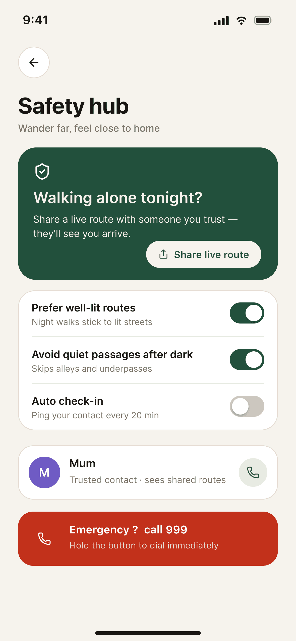
Safety woven in
Live route sharing and well-lit, step-free route options, one tap from the walk.
Trade-offs & Constraints: safety has to be dependable
Safety features only help if they can be relied on. The MVP keeps the set small: route options, live sharing and emergency access. I didn’t want to promise protections the product can’t guarantee.
Enough information to decide
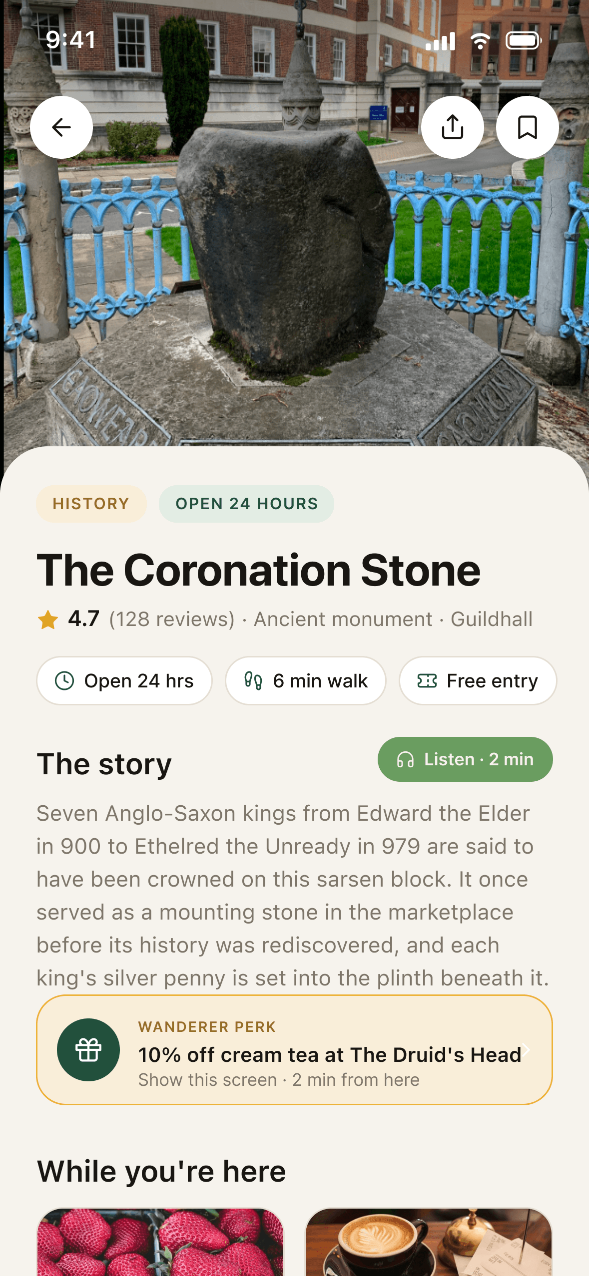
The user stories were clear about what a place page owes people: enough information to decide, and a reason to care.
The place page answers one question: is this worth my next free hour?

The story leads
A two-minute listen and a timeline. The reason to care comes first.
Good to know
Hours, price, step-free access, nearest loo. The details people decide with.
From deciding to going
Walk, bus or cycle. Directions start on the page, not in another app.
Trade-offs & Constraints: complete information over more places
Real place information is what the product runs on. A page missing its hours or fees breaks trust, so the MVP covers fewer places with complete information instead of many places with gaps.
USABILITY TESTING
Testing the high-fidelity prototype
I tested the high-fidelity prototype with four participants in one-to-one, think-aloud sessions built around the core discovery tasks. Earlier I tested the paper prototype (pen and paper, wired in Marvel Pop) with 2 participants, and the mid-fidelity version with 1.


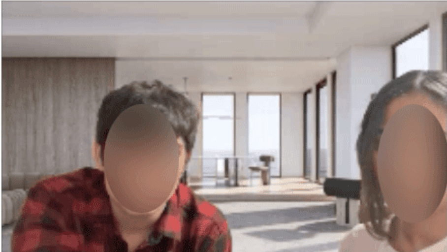
From the sessions, run in person and over video. Faces blurred for privacy.
PARTICIPANTS
4, in one-to-one task-based sessions
TASKS
7 core discovery tasks
METRICS
Completion, hesitation and assists, observed live
SUCCESS CRITERIA
Defined per task, before testing began
PAPER PROTOTYPE
2 participants
MID-FIDELITY
1 participant
HIGH-FIDELITY
4 participants (this study)
TASK
SUCCESS CRITERIA
01 · Discover a nearby place
Reaches a real place from the home feed without prompting.
02 · Explore categories
Opens a category and narrows it with a filter, unaided.
03 · Understand place details
Finds hours, price and access information on the place page.
04 · Decide whether to visit
Gives a confident yes or no using only the page.
05 · View navigation
Starts walking directions from the place page.
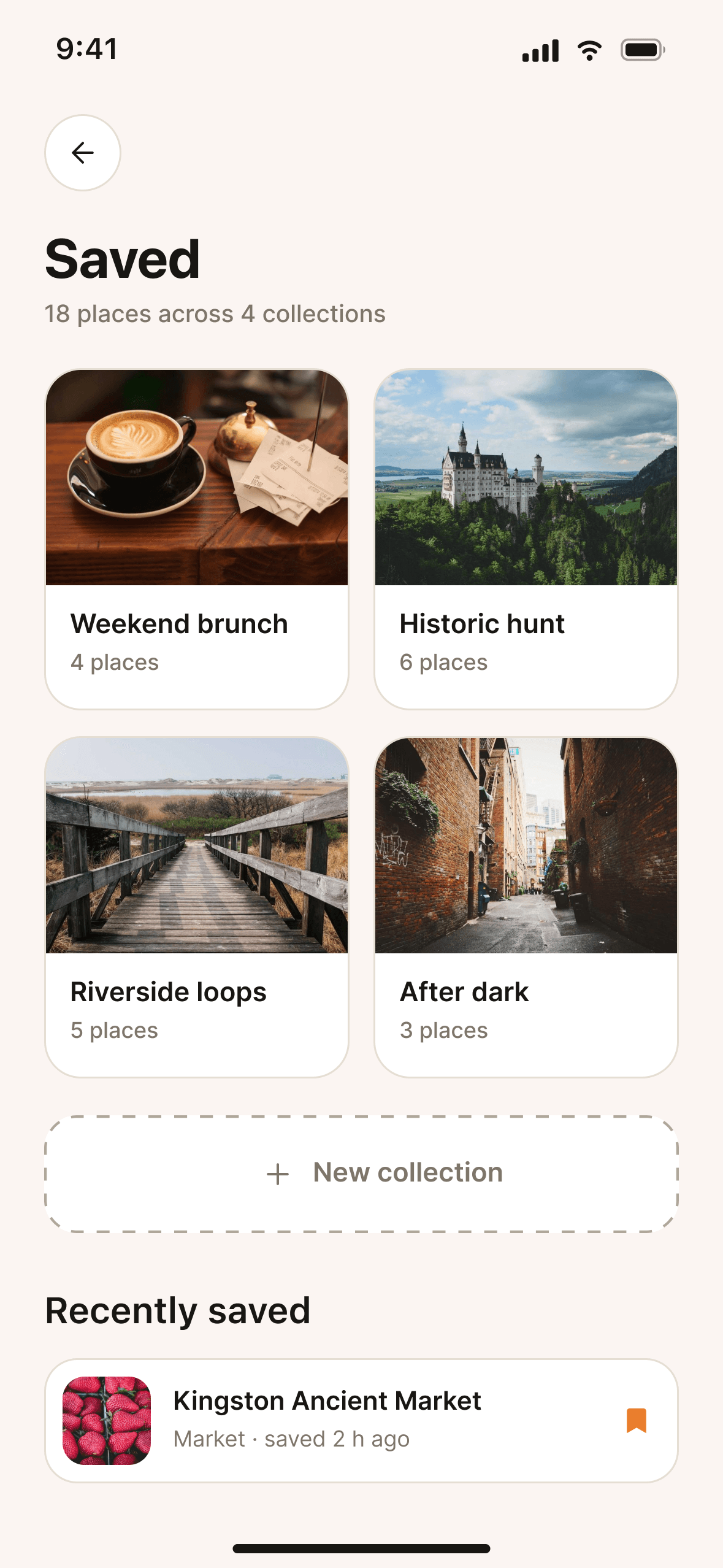
06 · Save a place
Saves it, then finds it again under Saved.
07 · Continue exploring
Returns to the feed or map without getting stuck.
WHAT WORKED
Every participant completed the core loop from feed to place page to directions without help. The story screens were the moment sessions came alive.
WHAT CAUSED HESITATION
Finding the way back from deep screens, locating the mode controls, and wanting reviews before committing to a visit.
WHAT CHANGED
Each hesitation became a design change: repositioned navigation, a dedicated back control, and reviews on the place page. Details below.
KEY FINDINGS
Participants weren’t sure where core navigation lived.
→
I moved the home button and mode selection to where people expected them and added clearer orientation cues. After that, the core loop didn’t need explaining.
There was no obvious way back from deep screens.
→
I added a back control that works from anywhere in the app, which removed the dead ends the sessions kept hitting.
People wanted reviews and richer information before committing.
→
I moved reviews and ratings into the place page, next to hours, fees and events, so deciding happens in one place.
TRACEABILITY
From research to design
None of the screens appeared out of nowhere. Here are four examples of the line from research finding to design decision to the final interface.
RESEARCH FINDING
People hesitate when they have no destination or purpose.
↓
DESIGN RESPONSE
Open with nearby suggestions. No search needed.
↓
INTERFACE
THE HOME FEED
RESEARCH FINDING
Feeling safe limits going out alone. This came up in interviews and the focus group.
↓
DESIGN RESPONSE
A Safety Hub with safer routes, live sharing and emergency access.
↓
INTERFACE
THE SAFETY HUB
RESEARCH FINDING
Users wanted hours, fees, events and reviews before deciding.
↓
DESIGN RESPONSE
A place page that leads with practical facts and in-app reviews.
↓
INTERFACE
THE PLACE PAGE
RESEARCH FINDING
Motivation dips at the deciding moment. It is the low point of the journey map.
↓
DESIGN RESPONSE
Location-aware nudges that always include a reason to go.
↓
INTERFACE
NOTIFICATIONS
REFLECTION
Reflection
The real problem sits before the app opens.
I started out thinking I was designing a discovery tool. The research kept moving the problem earlier, into motivation, purpose and confidence. The interface matters, but the product wins or loses at the moment of deciding.
Testing is cheapest when the prototype is.
Paper and Marvel Pop caught direction-level mistakes for the cost of an afternoon. By high fidelity, testing was catching interface friction: navigation, back controls, missing information. That is exactly what that round is for.
Evidence beats confidence.
Every design decision I can defend traces back to something a participant said or did. The ones I couldn’t trace were the ones testing overturned.
FUTURE WORK
Personalised recommendations
Tuning suggestions by interests, past visits and feedback, so the feed gets better the more it is used. This is what the third How-Might-We asked for.
Community content
User tips, reviews and shared discoveries. Participants kept describing this social layer, and it appears in the journey map opportunities.
Accessibility & inclusivity
Improving the experience for users with diverse needs and abilities, and testing it with the people it serves.
Local partnerships
Working with local businesses, tourism agencies and cultural institutions for exclusive offers and richer, more current content.
© 2026 Farzana Faisel. All rights reserved.